Ligne Libre
Challenge
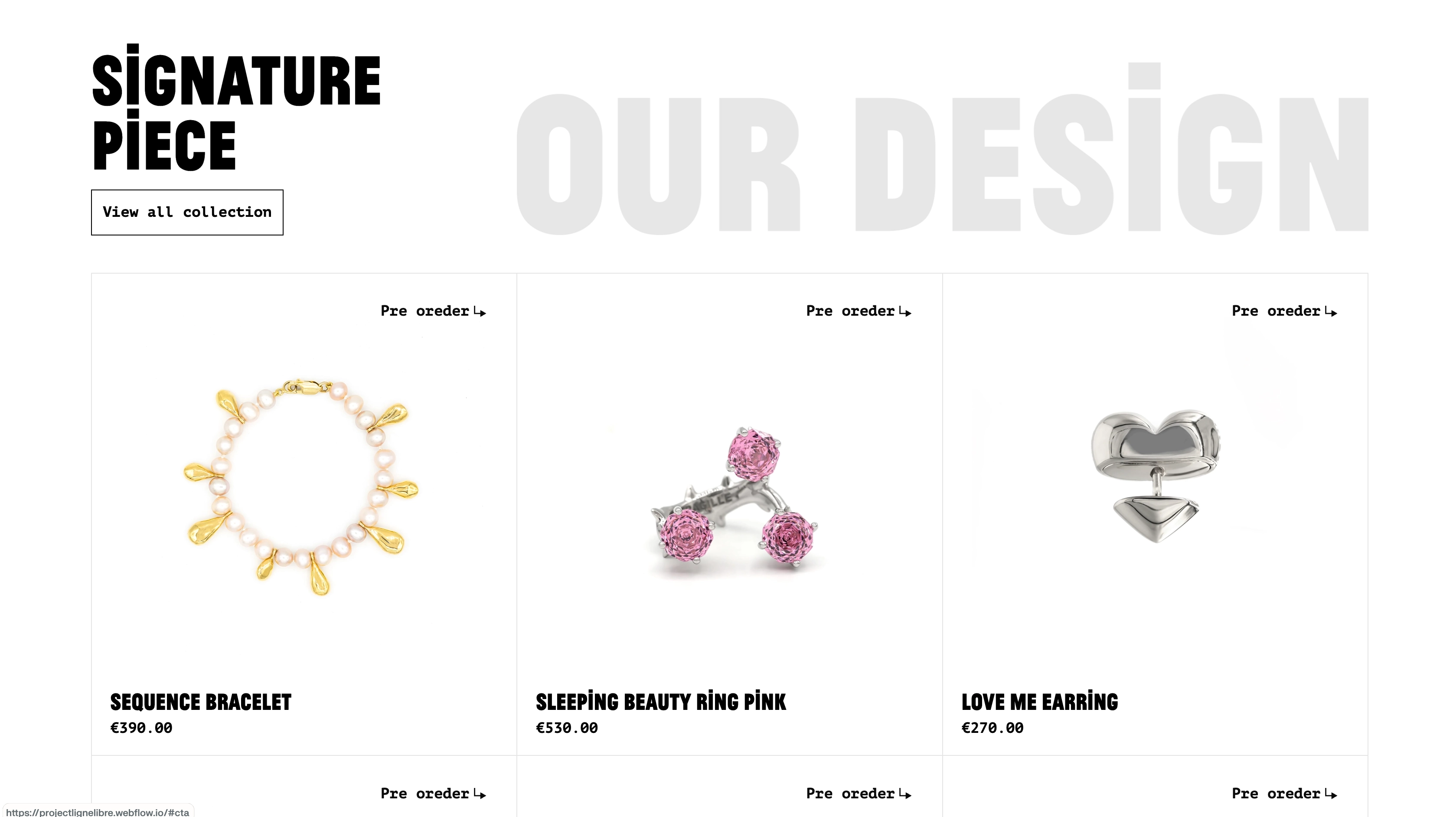
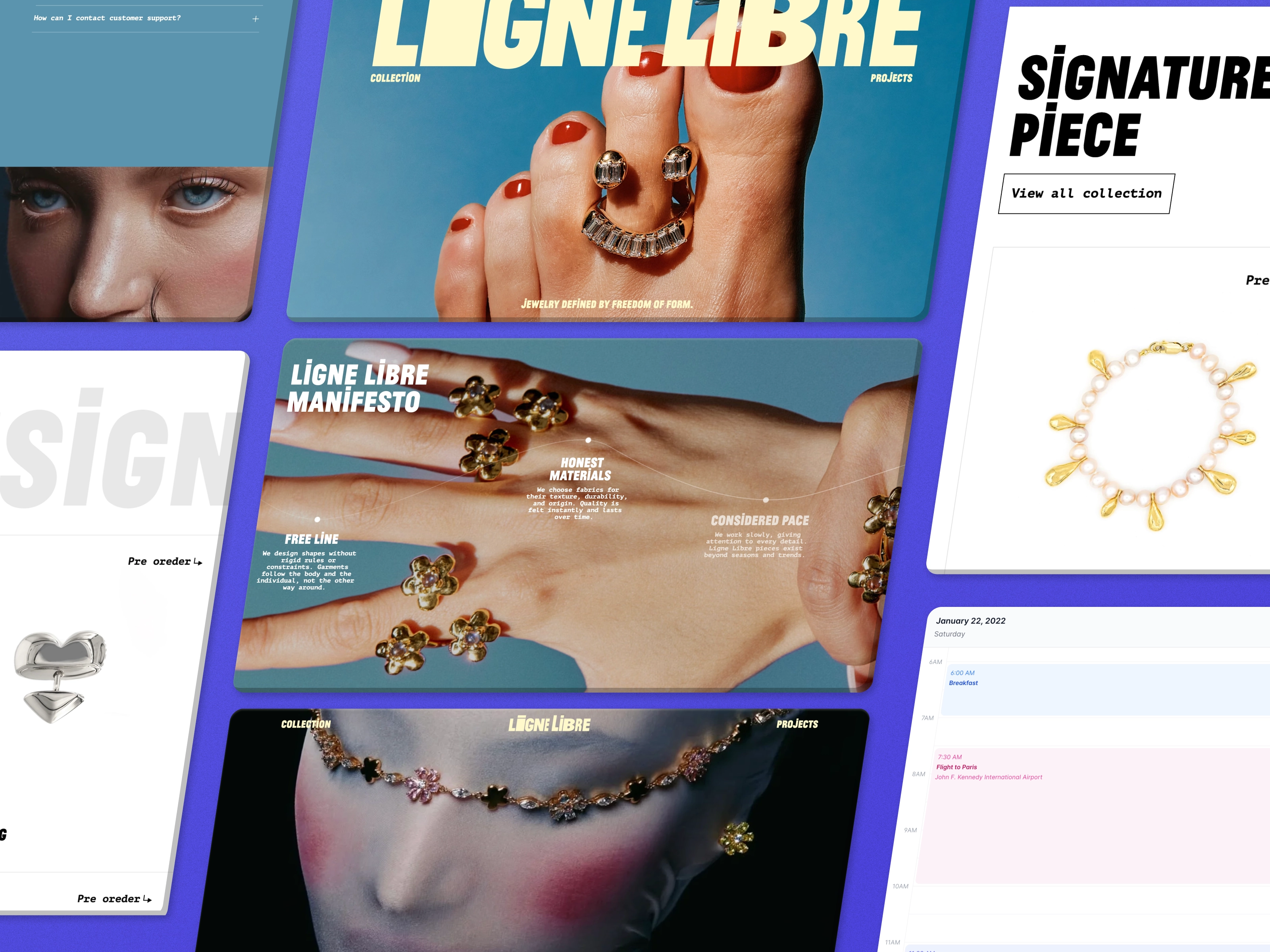
Ligne Libre needed a two-page website for their jewelry brand that matched their Figma design — bold, editorial typography, product photography doing most of the talking. The site needed to feel as considered and confident as the jewelry itself, not like a generic template with product photos dropped in.
Solution
Built the site pixel-accurate from Figma, then refined the motion during the build — a pinned hero, smooth transitions between sections, a custom dropdown for the pre-order flow — so the whole experience felt cohesive and intentional rather than a static layout with a few effects added on top. Every animation earned its place: it had to support the browsing experience, not distract from it.
Result
A fully responsive site that holds the editorial feel of the original design at every breakpoint, with motion that feels like part of the brand.